Why Are Visitors Leaving My Website So Quickly?

A visitor leaving quickly is not automatically a failure. They may have found an answer immediately, clicked a phone number or landed from an irrelevant campaign. But when important landing pages consistently lose qualified visitors before they engage, the first seconds of the experience deserve investigation. This guide focuses on early exits: the moment between the click and the user's decision to continue or leave.
Table of Contents
- First Check Whether the Exit Is Actually Bad
- Message Match in the First Screen
- Intrusive Elements Can End the Session
- Mobile Experience
- Technical Reliability and Core Web Vitals
- Search Intent and Content Match
- Trust and Proof
- CTA and Journey Friction
- Analytics and Measurement
- SEO and Internal Links
- Above the Fold Is About Reassurance, Not Fitting Everything
- Fix Order
- 48-Hour Triage
- 30-Day Improvement Plan
- When a Redesign Is the Right Answer
- Final Takeaway
- Check the Referrer Before Changing the Page
- The First Screen Should Confirm the Click
- Avoid Delayed Content That Pushes the Page Around
- Popups Should Respect Intent and Timing
- Navigation Should Help Orientation
- Long Pages Need Progressive Structure
- Track Meaningful Early Engagement
- Use Qualitative Evidence for High-Exit Pages
- Final Early-Exit Rule
- Check Whether the Visitor Can See Useful Content Before Accepting Cookies
- Use Page Titles That Match the Visitor's Mental Model
- Broken Links Create Fast Exits
- Check Mobile Font Loading and Flashing
- Use Internal Search Data Where Available
- Exit Pages Need Context
- Check Whether Ads Are Sending Users to the Wrong Version
- Use Session Depth Carefully
- Large Cookie and Chat UI Can Be Especially Harmful on Small Phones
- Content Introductions Should Earn Their Space
- Check Browser Back Behaviour
- Final First-Impression Rule
- Check Whether the Page Is Visually Complete Before Critical CSS or Fonts Arrive
- Use Breadcrumbs on Deep Content Sites
- Test the First Visit in an Incognito Session
- Check Geographic or Device Redirects
- Final Early-Exit Diagnosis Principle
- Review Heatmaps or Recordings Carefully
- Check the First Click Path
- Use Page-Speed and Experience Data Together
- Final Principle
- Final Early-Exit Check
- Closing SEO Note
- Frequently Asked Questions
Diagnostic Checklist
| Potential cause | What to inspect |
|---|---|
| Wrong traffic | query/campaign/source |
| Slow loading | LCP, media, scripts |
| Unclear hero | offer and audience clarity |
| Intrusive UI | popups, cookie/chat overlays |
| Mobile issues | heading wrap, navigation, tap targets |
| Trust | branding, proof, security/policies |
| Content | answer buried or irrelevant |
First Check Whether the Exit Is Actually Bad
A user can land on a contact page, tap the phone number and leave—that may be a successful session. A blog reader can get the answer without visiting a second page. Engagement metrics need context.
Define the intended action for the page before treating short sessions as a problem.
Message Match in the First Screen
The page should confirm that the click led to the expected destination. An ad for Shopify development should not land on a generic marketing-agency hero. A search for a specific service should see that service clearly.
Make the first heading and supporting copy concrete before adding clever brand language.
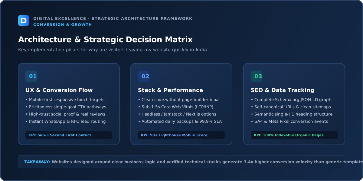
Intrusive Elements Can End the Session
Cookie banners, newsletter popups, chat widgets, app-download prompts and sticky bars can occupy most of a mobile screen. Each may have a business purpose, but together they can make the main content inaccessible.
Prioritise the user's original task. Delay non-essential interruptions when possible.
Mobile Experience
For “Why Are Visitors Leaving My Website So Quickly?”, treat mobile experience as a diagnostic checkpoint: compare it with the actual traffic source, landing-page intent and next conversion step before changing the rest of the site.
Review the issue on real mobile widths and devices, not only a desktop emulator. Check content hierarchy, typography, navigation, forms, buttons, media and any sticky or popup elements. Mobile problems can amplify small weaknesses because screen space and network conditions are constrained.
Compare mobile and desktop by the same traffic source when possible. A device gap can be caused by UX, but it can also be caused by different acquisition channels.
Technical Reliability and Core Web Vitals
For “Why Are Visitors Leaving My Website So Quickly?”, treat technical reliability and core web vitals as a diagnostic checkpoint: compare it with the actual traffic source, landing-page intent and next conversion step before changing the rest of the site.
Google's Core Web Vitals measure loading performance, interaction responsiveness and visual stability. Use them as diagnostic signals alongside real-user behaviour. Large images, scripts, plugins, apps, fonts and unstable components are common sources of friction.
Also test the actual business action. A fast site with a broken form, product selector or checkout still fails the user.
Search Intent and Content Match
Content should answer the reason the visitor clicked. If the page title promises a cost guide, do not hide all useful pricing information behind a consultation form. If a product ad promises a specific offer, keep the offer consistent.
Trust and Proof
Obvious layout bugs, stock-heavy visuals, unclear business identity or exaggerated claims can cause early distrust. Use specific proof and transparent information.
CTA and Journey Friction
Do not force a CTA before the visitor has enough information. Early CTAs can exist, but they should not dominate every screen.
Analytics and Measurement
Use landing-page engagement, scroll or key content interaction carefully, but validate with actual conversions. Segment by source and device to avoid blaming the page for low-intent traffic.
SEO and Internal Links
For “Why Are Visitors Leaving My Website So Quickly?”, treat seo and internal links as a diagnostic checkpoint: compare it with the actual traffic source, landing-page intent and next conversion step before changing the rest of the site.
Review which queries and pages generate the traffic. Total sessions are not enough. A page can rank for broad informational terms that never had strong commercial intent.
Use contextual internal links to connect useful guides with relevant service, category or product pages. Google recommends crawlable links with meaningful anchor text. Do not create repetitive doorway pages simply to capture every variation of a phrase.
Above the Fold Is About Reassurance, Not Fitting Everything
You do not need to place every benefit, testimonial and button in the first viewport. The first screen should reassure the visitor that the page is relevant and worth continuing.
A clear heading, concise context, strong visual hierarchy and one sensible next step are often enough. Let the rest of the page answer deeper questions progressively.
For a related buying decision, see High Website Bounce Rate? What It Actually Means.
Fix Order
For “Why Are Visitors Leaving My Website So Quickly?”, treat fix order as a diagnostic checkpoint: compare it with the actual traffic source, landing-page intent and next conversion step before changing the rest of the site.
Fix broken functionality first, then traffic mismatch, unclear message, missing proof, mobile friction, conversion friction and performance polish. This prevents teams from running small experiments on top of a structural problem.
Document changes and deployment dates so you can compare before and after without relying on memory.
48-Hour Triage
For “Why Are Visitors Leaving My Website So Quickly?”, treat 48-hour triage as a diagnostic checkpoint: compare it with the actual traffic source, landing-page intent and next conversion step before changing the rest of the site.
Verify analytics, reproduce the issue on mobile, test the main conversion path and review the top traffic sources and landing pages. Identify three high-confidence problems rather than making a list of 30 cosmetic ideas.
Implement obvious reliability fixes immediately. For behavioural changes, write a hypothesis and decide which metric should move if the fix works.
30-Day Improvement Plan
For “Why Are Visitors Leaving My Website So Quickly?”, treat 30-day improvement plan as a diagnostic checkpoint: compare it with the actual traffic source, landing-page intent and next conversion step before changing the rest of the site.
Week one: measurement and technical errors. Week two: message, content and proof. Week three: mobile and conversion path. Week four: review results and plan the next iteration.
Low-traffic sites need more qualitative evidence—sales calls, customer questions, support messages—because small analytics samples are noisy.
When a Redesign Is the Right Answer
For “Why Are Visitors Leaving My Website So Quickly?”, treat when a redesign is the right answer as a diagnostic checkpoint: compare it with the actual traffic source, landing-page intent and next conversion step before changing the rest of the site.
Redesign when the information architecture, design system, CMS or technical foundation causes repeated problems that cannot be fixed cleanly. If the issue is one page, one form or one campaign, targeted improvements are usually faster and safer.
Preserve valuable URLs and content during any redesign. A visual refresh should not accidentally destroy search or operational assets.
Final Takeaway
Early exits are usually a signal of mismatch or friction. Make the first experience fast, relevant and easy to continue.
Check the Referrer Before Changing the Page
Users from social media, display ads or broad discovery content may bounce faster than branded search visitors. Compare early exits by channel and campaign before redesigning the page.
A low-intent source can create poor engagement even when the page works well for qualified traffic.
The First Screen Should Confirm the Click
Repeat the essential promise or topic in plain language. If the visitor searched for website development cost, the page should show cost information quickly. If an ad promoted a product, the relevant product or offer should be obvious.
Message match reduces the feeling of landing on the wrong page.
Avoid Delayed Content That Pushes the Page Around
Cookie banners, web fonts, ads and widgets can change the layout after load. Reserve space and avoid inserting large elements above the content.
A stable first screen feels faster and more trustworthy even before deeper performance work.
Popups Should Respect Intent and Timing
A newsletter prompt appearing before the visitor has read a sentence adds friction without earning attention. Delay non-essential overlays and make them easy to close on mobile.
High-intent pages may need even fewer interruptions.
Long Pages Need Progressive Structure
Use headings, short paragraphs, tables or callouts to help readers scan. Put the direct answer early, then allow deeper detail for users who need it.
Do not force every visitor through a long introduction before the useful content begins.
For a useful scope comparison, read Website Losing Customers on Mobile? 15 UX Problems to Check.
Track Meaningful Early Engagement
Scroll depth can be useful, but it is not inherently a business outcome. Track interactions that show intent: product views, CTA clicks, form starts or specific content consumption where relevant.
A reader can find value without scrolling to the bottom.
Use Qualitative Evidence for High-Exit Pages
Ask users or sales teams what was unclear, review session recordings when appropriate and inspect support questions. Analytics tells you where people leave; qualitative research can help explain why.
Final Early-Exit Rule
Make the page load quickly, confirm relevance immediately and remove obstacles between the visitor and the information they came for. Then judge exits against the page's real purpose.
Check Whether the Visitor Can See Useful Content Before Accepting Cookies
Consent requirements vary, but the banner should not make the underlying page effectively unusable on mobile. Design necessary controls clearly and avoid stacking it with chat and promotional popups.
The main content should remain understandable as soon as legally and technically appropriate.
Use Page Titles That Match the Visitor's Mental Model
Internal brand names or clever campaign labels can confuse search visitors. The visible H1 should confirm the service, product or answer they expected.
Clarity in the first seconds reduces unnecessary back-button behaviour.
Broken Links Create Fast Exits
Test prominent navigation, cards and CTAs after every major deployment. A 404 from the first click can end a session immediately and erode trust.
Use automated broken-link checks plus manual QA for critical journeys.
Check Mobile Font Loading and Flashing
A page that initially displays invisible or dramatically different text can feel unstable. Configure font loading so content remains readable while brand fonts load.
Avoid loading many weights that the page does not use.
Use Internal Search Data Where Available
On larger sites, search terms reveal what visitors expected to find but could not see in navigation. Frequent searches for pricing, returns, a product category or location can point to information-architecture problems.
Exit Pages Need Context
A page from which users leave is not necessarily a bad page; it may be the natural end of the journey. Compare the exit with preceding actions and conversions before deciding to change it.
Analytics should be interpreted as a sequence, not isolated numbers.
Check Whether Ads Are Sending Users to the Wrong Version
Campaign URLs can retain old parameters, redirect to outdated pages or land on a generic homepage after a redesign. Verify the exact destination from the live ad or email.
Use Session Depth Carefully
More pages per session can indicate exploration or confusion. If users bounce between pricing, FAQ and service pages repeatedly, important information may be fragmented.
For the next planning step, use Website Not Building Trust? 15 Signals Customers Look For.
Large Cookie and Chat UI Can Be Especially Harmful on Small Phones
Test the combined occupied screen area of consent, navigation and floating widgets. Users should still be able to read and scroll normally.
Content Introductions Should Earn Their Space
Long generic openings delay the answer. Start with the user's actual question, then explain context only where it improves understanding.
Check Browser Back Behaviour
Single-page app transitions, modals or filters can interfere with the back button. Users should be able to return to search results or the previous state predictably.
Final First-Impression Rule
In the first few seconds, confirm relevance, show stable useful content and avoid forcing an interaction that was not requested. That is the foundation for deeper engagement.
Check Whether the Page Is Visually Complete Before Critical CSS or Fonts Arrive
A flash of unstyled or empty content can create a poor first impression. Configure rendering so the main message remains readable during asset loading.
Use Breadcrumbs on Deep Content Sites
Breadcrumbs can help users understand where an article, product or service sits in the site and provide a low-friction route to related categories.
They are especially useful when users land directly from search.
Test the First Visit in an Incognito Session
Logged-in users or cached browsers can hide cookie banners, slow first-load assets or broken new-user onboarding. Review important pages as a first-time visitor.
Check Geographic or Device Redirects
Automatic redirects based on country, language or device can send users to an unexpected page or create loops. Test important audience segments.
Final Early-Exit Diagnosis Principle
The page earns more attention when it quickly proves relevance, remains stable and gives control to the user. Remove obstacles before trying to manufacture engagement.
Review Heatmaps or Recordings Carefully
Behaviour tools can reveal rage clicks, dead clicks or ignored content, but samples may be biased and privacy requirements matter. Use them to generate hypotheses, not to declare why every visitor left.
Check the First Click Path
Look at what users click first from key landing pages. If the dominant first click is a workaround—such as the logo, footer or browser back—important information may be missing or poorly prioritised.
Use Page-Speed and Experience Data Together
A fast page can still lose visitors if the message is wrong. A relevant page can still lose impatient users if it is slow. Review both layers before deciding on the fix.
Final Principle
Early engagement improves when the page immediately confirms relevance, remains easy to use and respects the visitor's original intent.
Final Early-Exit Check
Open the page from the actual ad, search result or social link on a fresh mobile session. If the first screen does not immediately match the promise that earned the click, fix that mismatch before experimenting with deeper sections.
Closing SEO Note
The first screen should answer one question immediately: am I in the right place for what I clicked?
For implementation options, explore website development services and Digital Excellence portfolio.
Frequently Asked Questions
Is a quick exit always bad?
No. Some users complete their task quickly. Interpret exits based on page purpose.
Can slow speed make visitors leave?
Yes, especially on mobile, but check traffic relevance and message clarity too.
Should I remove all popups?
Not necessarily. Prioritise timing, size and whether they obstruct the main task.
How much content belongs above the fold?
Enough to establish relevance and direction; not every argument needs to fit there.
Why do ad visitors leave faster?
The targeting or message may not match the landing page, or the audience may be broader.
Should I redesign the hero?
If relevance and clarity are weak, improve it; do not redesign solely from one engagement metric.
Need a Landing-Page UX Audit?
Need a website scope or quote based on your real requirements rather than a generic package? Digital Excellence can review the pages, platform, integrations, SEO needs and launch priorities.